My Report: A Trader-to-Trader Tour of the 6 Tabs
A walkthrough of the My Report analytics module in EdrisFinance. What each of the 6 tabs actually shows you, how to read it, and which numbers to look at first on a Sunday review.
Most trading journals show you what happened. A list of trades, maybe a P&L curve, and that's it. You close it and feel slightly better or slightly worse, and then you trade Monday the same way you did last Monday.
My Report is the part of EdrisFinance built to fix that. It's six tabs, each one looking at your trades from a different angle, so by the end you actually know something about how you trade — not just how you did this week.
This is a walkthrough of all six. What's in them, what to look at first, and which numbers actually change your behavior versus which ones are just nice to look at.
What is My Report
My Report is the analytics layer that sits on top of your trade history. You import trades from MetaTrader, Binance, Interactive Brokers, eToro — any of the 40+ brokers supported — and My Report runs the math.
It's available on every plan. FREE gets you up to 2 accounts, PRO opens it up to 10 and unlocks the advanced metrics.
The six tabs are:
- Overview
- P&L Stats
- Time Analysis
- Market Edge
- Risk
- Volume & Fees
Each one answers a different question. Here's how I use them.
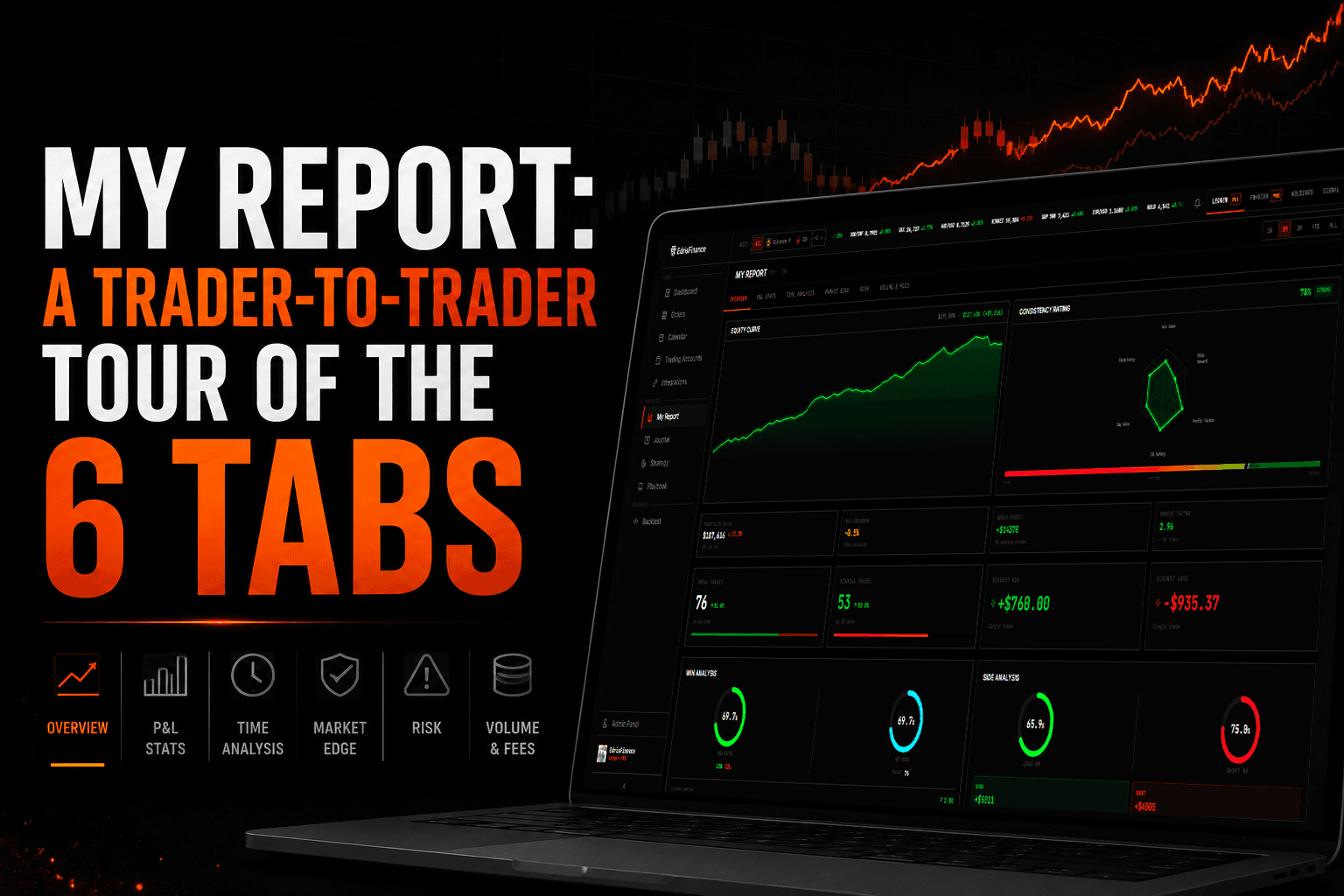
1. Overview — The Sunday-morning glance
Overview is the tab you open first. It's the one that tells you, in about ten seconds, whether you had a good week or a bad one.
You get the standard headline numbers — balance, net P&L, win rate, profit factor, max drawdown, average R:R — plus the equity curve. Nothing fancy. The point is to give you a feel for the shape of your trading before you go deeper.
The thing I actually look at here is the equity curve, not the numbers. Numbers lie because they average. A curve doesn't. If you see a steady climb with one cliff, you know you had one bad day. If you see a sawtooth, you know you're a coin flip with extra steps. The shape tells you what kind of trader you've been this month.
The Recent Executions strip at the bottom is there for quick sanity — did anything weird get imported, is the size column reasonable, did a short get tagged as a long. It's a fact-check, not a tool.
If Overview looks fine, you can skip the rest. If something feels off — the curve has a weird kink, the drawdown looks bigger than it felt — that's when you open the other five tabs.
2. P&L Stats — The why behind the number
Overview tells you that you made $4,200 this month. P&L Stats tells you whether you did it well or got lucky.
This is the tab where win rate, profit factor, expectancy, average win, average loss, largest win, largest loss, and the win/loss distribution live. There's also the breakdown by long vs. short, and the streak data — longest winning streak, longest losing streak, current streak.
What I look at first: expectancy. It's the only number on this tab that tells you, on average, what one trade is worth to you. If expectancy is positive and stable, your edge is real. If it swings wildly between months, you have a system that depends on conditions you don't control.
The second thing: the gap between average win and average loss. If your average loss is bigger than your average win, you need a win rate above 50% just to break even. A lot of traders find out here that they're profitable purely on win rate — and as soon as the rate drops, they're cooked.
The streak data is the one that hits emotionally. Seeing "longest losing streak: 7" makes you take a breath, because you remember exactly which seven trades those were.
See it in action
This is a walkthrough of My Report from our channel — the same tabs, but live with real data.
3. Time Analysis — When you actually make money
Time Analysis is the tab that exposes things you can't see in your head. You think you trade well in the morning. Time Analysis tells you whether that's true.
You get a daily heatmap (P&L by day of week), an hourly breakdown (P&L by hour of day), a calendar view, and the holding-time distribution. There's also a day-of-month breakdown if you trade enough volume for it to matter.
Read the daily heatmap first. Almost every trader has one day of the week that quietly drags them down. Friday afternoon, Monday open, Wednesday lunch — whatever it is, your heatmap will name it. Once you know which day is the leak, you have two options: stop trading it, or trade it smaller. Both work.
The hourly breakdown does the same thing but tighter. If your worst hour is between noon and 1pm and you keep trading through lunch, that's not a market problem. That's a you problem.
Holding time is the sneaky one. If your winners average 4 hours and your losers average 14, you're holding losers too long. Reverse it and you're cutting winners too early. The number itself isn't right or wrong — the gap between winners and losers is what matters.
4. Market Edge — Where your edge actually is
Market Edge is the tab that breaks your trades down by what you traded. Pair, asset class, sector, broker. It's where you find out that you're a great EUR/USD trader who keeps blowing it up on GBP/JPY.
The pair breakdown shows P&L, win rate, and trade count per instrument. Sort by net P&L and you'll usually find that 2-3 instruments are doing 80% of the work. The rest are either flat or actively costing you money.
Most traders don't trim because cutting an instrument feels like giving up. But the math is clean: if XAUUSD has cost you net negative over 60 trades, the chance it suddenly turns positive in the next 10 is the same as flipping a coin. Trim it.
There's also a sector/asset class view if you trade across stocks, crypto, forex, and futures. Useful for traders who think they're diversified and find out they're just making the same bet through five different tickers.
5. Risk — The tab nobody opens
Risk is the boring one. Nobody opens it after a green week. Open it anyway.
You get max drawdown (in dollars and percent), current drawdown, time-to-recover stats, the Sharpe and Sortino ratios, and the risk-per-trade distribution. There's a drawdown curve underneath the equity curve so you can see the underwater periods.
The number to look at: max drawdown as a percentage of starting balance. Not dollars. Dollars feel different when you scale up. Percent stays honest. If your max drawdown is 18% on a $10K account, it'll be 18% on a $100K account too — but 18% of $100K is a different feeling.
The second number: time to recover. How long does it take you, on average, to climb back to a new equity high after a drawdown? If the answer is "weeks," your size is probably correct. If the answer is "months," you're sizing too aggressively and the variance is eating you.
Risk-per-trade distribution is the third one. If you say you risk 1% per trade and the distribution shows trades ranging from 0.3% to 4.2%, you don't actually have a risk rule. You have a vague intention.
6. Volume & Fees — The leak you didn't know you had
Last tab. Most traders skip it. They shouldn't.
Volume & Fees tracks how much you traded (in notional value), what it cost you in commissions and swaps, and what percentage of your gross P&L went to the broker.
The number that surprises people: fees as a percentage of gross profit. A scalper running 200 trades a month can easily give away 15-25% of their winnings to commissions and spread without noticing. If that number is over 10%, you have two ways to fix it: trade less, or find a cheaper broker.
The swap/overnight financing line is the second one. If you hold positions overnight on margin, this number compounds quietly. A few traders find out here that their best-looking month was actually break-even after swap fees.
This isn't a tab you check every week. It's a tab you check every quarter, because the leaks here are slow.
How to actually use My Report
Six tabs is a lot. You don't need to open all of them every Sunday. Here's the cadence that works for most traders:
- Every Sunday: Overview. 60 seconds. Did anything weird happen?
- End of month: P&L Stats + Time Analysis. Where did money come from, when did it come in.
- End of quarter: Market Edge + Risk + Volume & Fees. The structural stuff. What to trim, what to size differently, what to stop paying for.
That's it. The tabs don't change your trading — what you do with them does.
The point
A trading journal that just lists trades is a log. A trading journal that breaks them down by day, hour, instrument, drawdown, and cost is a mirror. Mirrors are uncomfortable but they're useful.
If you're already tracking trades somewhere, import them into EdrisFinance and open My Report. Most traders find at least one leak they didn't know they had inside the first ten minutes. Sometimes it's a pair, sometimes it's a time of day, sometimes it's a broker eating a quarter of their edge.
You don't need a new strategy. You need to see the one you already have, clearly.
Start tracking your trades for free
Import your trades from MetaTrader, Binance, and 40+ brokers. Get instant analytics and AI-powered weekly insights.
Get started free →